
It gets cold and we turn on the heat. It gets hot and we turn on the air conditioning. External temperature is the biggest driver of our household energy use, but how exactly does this relationship look? Anonymized data from 500 of Chai Energy‘s California customers1 gives us some insight here:

Plotting daily temperature against daily energy2 use shows us a few things:
- People use more energy when it’s too hot or too cold.
- The average daily value for these California residents is 23,000Wh, somewhat less than the national average of 30,300Wh.
- The 23,000Wh average is heavily influenced by outliers. The typical person (the median) uses around 15,000Wh of energy each day, but this is hard to see because…
- Some people use massive amounts of energy! The most voracious consumer uses an average of 600,000 Wh per day! Holy shit, that’s forty times the typical amount. Aggregated over a year, that’s enough energy to run a modern aircraft carrier on emergency-power mode for almost a month. Or enough to run a toaster continuously for 7,600 years.
Given how much The 1% is stretching the y-axis, I think the plot might be more useful if we ignore the energy outliers:

There we go. Now we can see that:
- The darkest part of the blob is centered around 10,000-20,000 daily Wh. California temperatures are remarkably stable and household energy use tends to follow suit.
- There’s a faint region growing upward from the right side of the blob. See it above 70-80F? These are the subset of people who (over)react to heat by cranking up the A/C!
None of this should come as a huge surprise: people use energy when it gets hot and when it gets cold. But remember, temperature changes as a function of the season. We should be able to see this over a calendar year. To fit both temperature and energy on the same plot, I standardized them both:
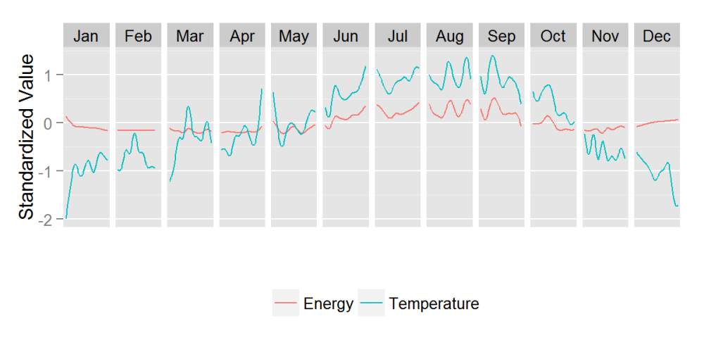
This shows us that temperature actually does vary in California! However, there’s not too much variability in energy use. The lack of energy differences suggests that people don’t need much heating or cooling to cope with Cali weather, even at its extremes. A similar energy plot for a town on the East Coast would probably look a lot more turbulent.Ready for the cool part though?
The cold outside doesn’t always line up with how cold we feel (see psychophysics). You might feel like 50ºF (10ºC) in the summer is frigid while the same 50ºF (10ºC) in the winter is balmy. Same temperature, different reactions. And maybe different energy use patterns!
Controlling for daily temperature3 shows us how this might play out.
In the graph below, the red bars are raw energy: uncorrected for daily temperature. The blue bars are hypothetical values: what energy use would look like if you controlled for daily temperature. When we control for temperature, we produce a value where any deviations from zero happen for reasons other than temperature.

So what do we see? The blue bars are not all equal to zero. For these blue bars, any deviation from zero occurs for reasons other than temperature.People are more liberal with their energy in the summer and winter than they “should” be (>0), and more conservative in the spring and fall than they “should” be (<0). That means that the same hot weather might have a different effect on A/C use depending on whether it’s the summer or the spring. On the flip-side, people who feel cold in the fall might be more likely to suck it up and put on a sweater than people in the winter—who more readily crank up the heat.

Does that ring true with how you use your energy? Thanks for reading!
Want more data visualization? Check out my other posts at: https://vizthis.wordpress.com/
Footnotes
1 The data analyzed for this post was only from Chai’s California customers. Chai currently only serves California.
2 The unit of energy used in this post is Watt-hours, which corresponds to one watt of power expended for one hour of time.
3 I controlled for daily temperature by saving the residualized values from a regression model predicting energy use with temperature (linear) and the square of temperature (quadratic).